UI as strategy
How I cut compliance product build time by 50%, without compromising quality
Company
Zalando SE is the leading European online retailer.
In 2024 Zalando:
Served 51M+ customers
Operated in 25 European markets
Delivered 250M+ goods
Earned €10.5B in revenue
Team
I was part of a cross-functional team in Zalando's B2B/B2E org.
The team included:
1 Product Manager
1 Program Manager
6 Back end developers
2 Front end developers
Role
As the Leading Product Designer I:
Conducted user and market research
Rapid prototyped wireframes and hi-fi mockups
Drove concept and usability tests
Supported engineering through implementation
Gathered user feedback
Continuously iterated
Timeline
March 2023 → August 2024
Disclaimer
All product or other sensitive data was anonymized on the screens shared below.
Problem
1. Regulations were new, complex and ever-changing
New directives like the General Product Safety Regulations (active since Dec 2024) frequently trigger updates to Zalando’s operations.
2. Noncompliance came with a big price tag
Failure to meet the EU regulations across sustainability, safety, and consumer protection or face penalties up to 2% of its €10.5B annual revenue.
3. The pace of change meant responses were reactive
Each new regulation led to the creation of standalone compliance tools, built from scratch by newly formed teams.
4. This led to design and development bottlenecks
Designing, developing, and maintaining one-off solutions drained time and resources, slowing delivery.
5. Our users started to feel the impact of our approach
Warehouse staff and lab operators had to juggle multiple disconnected tools with inconsistent workflows.
6. More processes and systems started to feel the effects
Learning multiple systems made onboarding slow and everyday tasks unnecessarily long and complex to complete.
7. Suddenly…we couldn't scale!
The reactive approach didn’t scale, straining the tech org and putting compliance and efficiency at risk.
Goal
I was part of a cross-functional team assigned with designing a strategic approach to our digital compliance tooling. This project was strategic for the company and we had Ambitious KPIs set up by Zalando's leadership team.
-50
%
Product to market time
-10
%
Time to complete task
-50
%
User onboarding time
User research
Discovering a common workflow for diverse compliance needs

Researching compliance: Working through the details to find the big picture
I led research to map current and future compliance needs, interviewing 36 SMEs and 12 department leads across 21 hours. Though aiming for a high-level view, I quickly dove into detailed workflows to uncover patterns and tech gaps across teams.

Jobs-to-Be-Done: Finding common ground for streamlining processes
To move forward, I tried a different approach: I developed a simple assumption that all processes followed the same high-level structure, and set out to verify it.
Using the JTBD framework, I mapped key steps:
Assess risk
Create task
Execute task
Review task
Decide
This was a huge win! This exercise confirmed my assumption and validated that I could design a reusable application architecture, and also pinpointing areas requiring future customization.
Design iterations
Organizing compliance information for diverse user needs
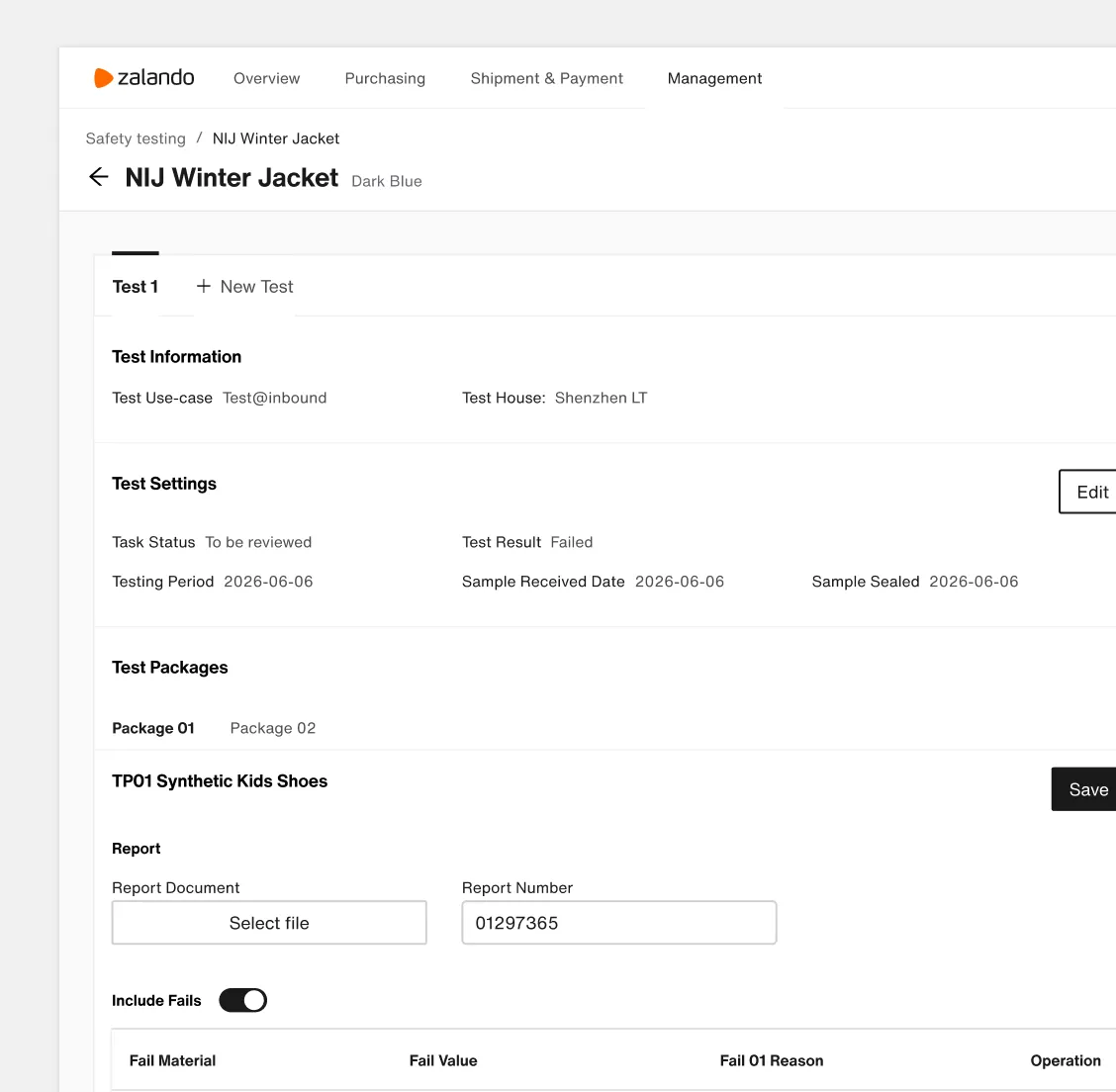
Using topics to structure content
Based on the existing tool and user feedback, I began by organizing the content into clear topics (e.g. Test Information, Test Settings, Test Packages, etc.). I explored various information architectures, groupings, and visual styles.
But I quickly ran into key challenges:
How will different users locate their specific call-to-action in the middle of multiple topics?
How can the content be structured to clearly communicate the progression of the task?
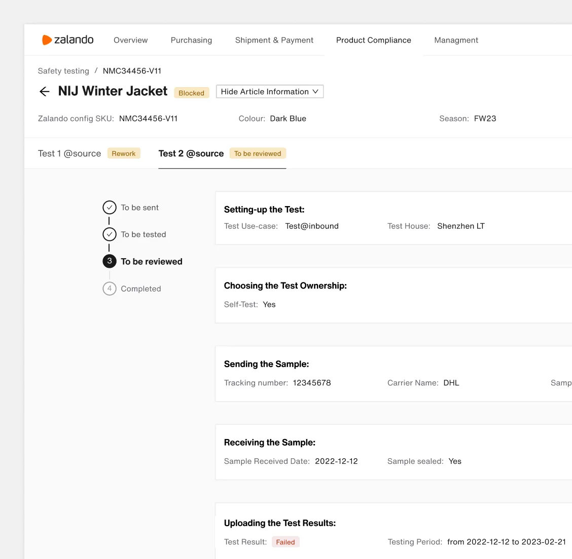
Using the flow to build an experience
I shifted gears and chose to follow the workflow instead. This was better, but even with this solution, some key questions remained:
How will different users find their specific call-to-action across multiple steps and topics? How to structure content for that
And will this approach scale across all compliance processes?
I dug into more variations of information architecture, layout groupings, and visual styles.
Solution
1. Laying the foundation with a minimalist Information Architecture
I knew compliance applications are task-driven, so I decided to make tasks the central unit of our solution’s information architecture. At a high level, the user would see:
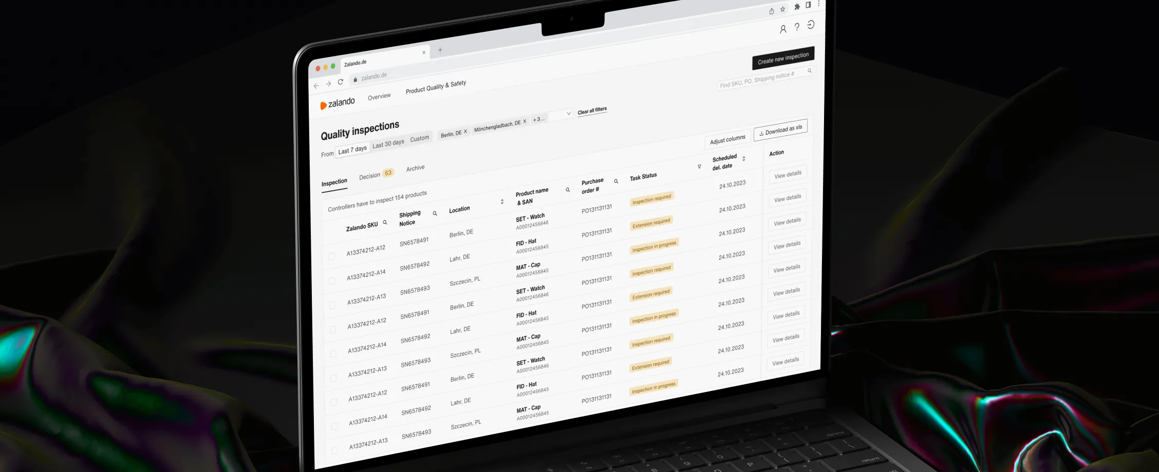
Task Overview:
Dashboard page. All users can see an overview of all ongoing and completed tasks.
Task Execution
Detail page. All users can act on the ongoing tasks or review completed tasks

2. A page layout designed for clear, intuitive access to information
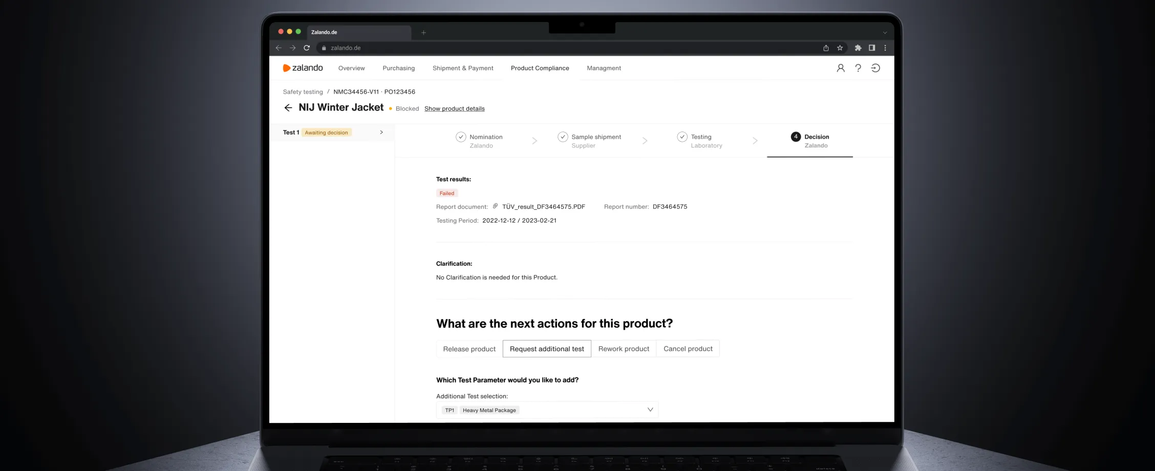
Transparent Archive Log
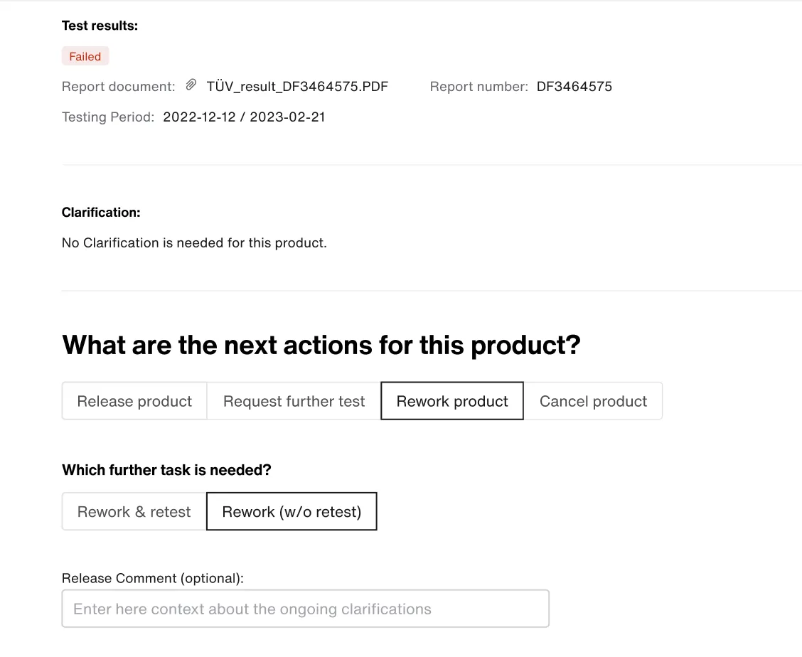
Inspired by GitHub, I designed an archive log that clearly displays all actions taken on a Task. It gives users full visibility into task history and serves as a reliable source of truth during compliance audits.
Focused Experience by User Group
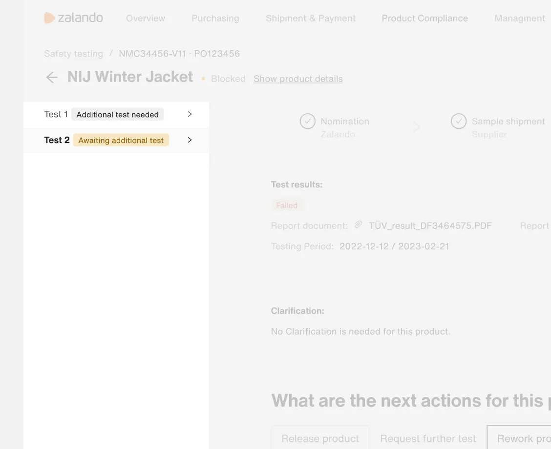
I used tabs and steppers to break down workflows by user group, allowing each group to focus only on their relevant steps. Badges and notifications highlighted required actions, making collaboration clearer and more efficient.
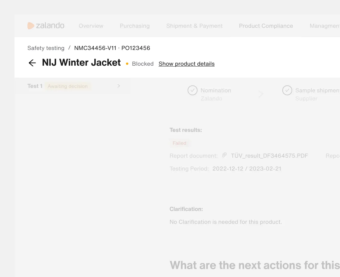
Task Identification at a Glance
The page header surfaces key task details, clearly visible to all users, so anyone can quickly understand the task’s context without digging through the interface.
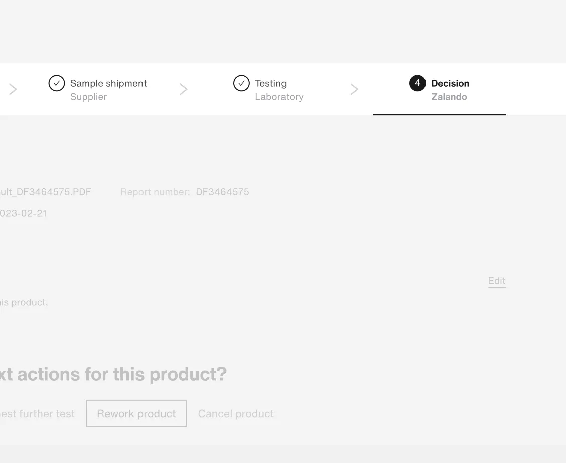
Seamless Task Navigation
An optional left panel appears when multiple tasks are linked to an article, enabling users to switch between tasks quickly without losing context.
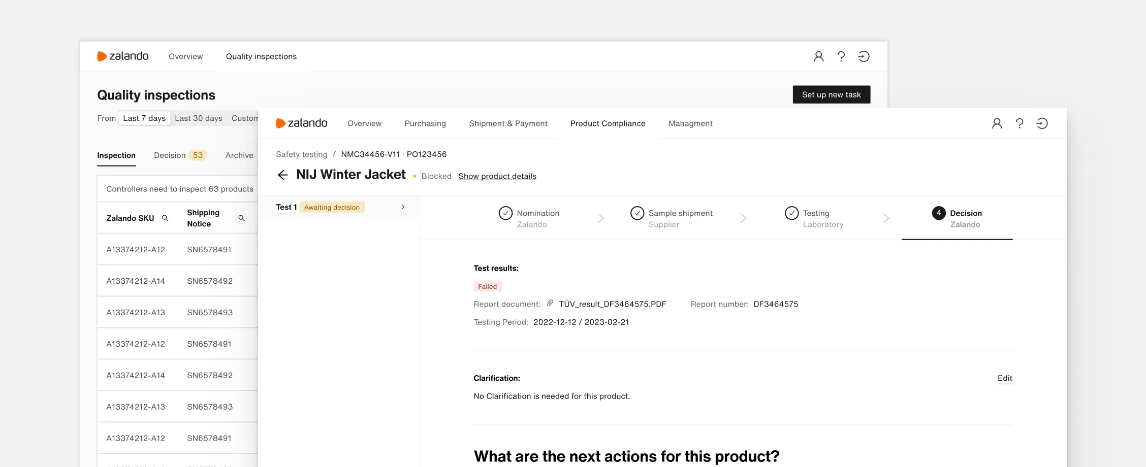
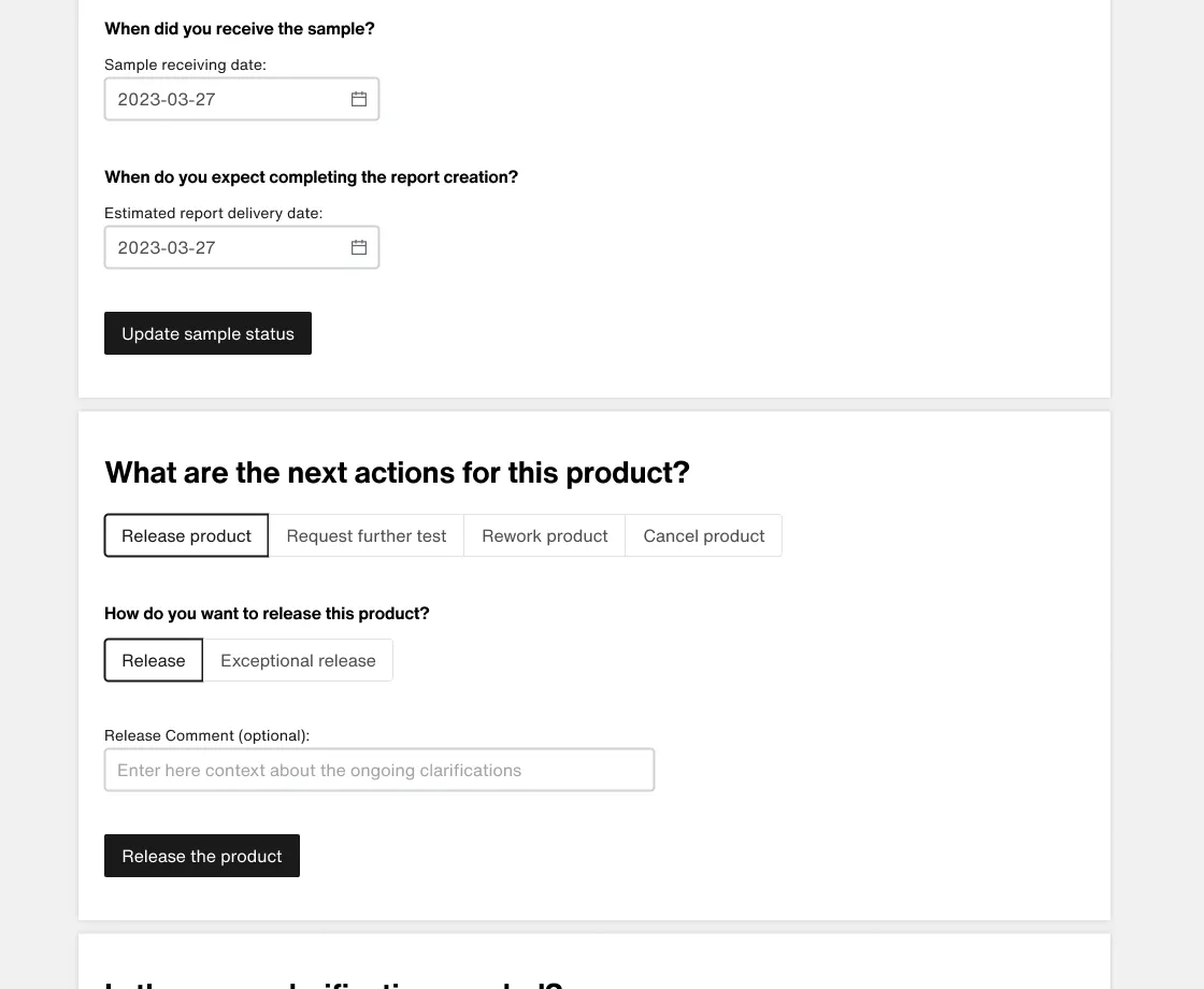
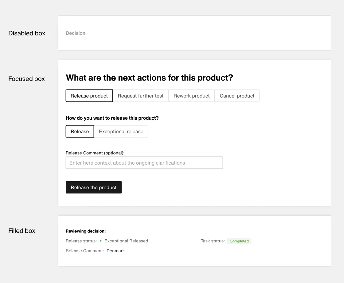
3. Modular interactions with a scalable dialog system to serve varied user needs
The best part was that the archive log was built using modular dialog boxes. I had to accommodate a wide range of workflows and user types, from warehouse staff to laboratory technicians. Some workflows varied based on the environment, while others adapted dynamically depending on user input. Inspired by the flexibility of e-commerce checkout flows, I designed a system capable of handling all these scenarios seamlessly.
I designed distinct states for each dialog box. I emphasized visual differences between steps to make the call-to-action instantly recognizable.
Impact
The result: Reduced time and costs across operations
-50
%
Product to market time
We reduced the time for launching new apps by 50%. Zalando was able to launch 4 new compliance products in the first 12 months after going live.
-30
%
Support/maintenance
We reduced the support maintenance by 30% (from 3 to 1 teams).
-20
%
Time to complete task
We were hoping to break even and did better than expected, and reduced the time to complete a quality inspection by 20%.
?
User onboarding time
Finally, we needed to onboard users faster in warehouses, factories, and laboratories. When I left the company, we didn't have conclusive data on this KPI, but the data was trending positive.
© 2025